Special CSS3 for some browsers
In some special cases when you need special css to handle multiple browsers, here’s how to add new css for each type of browser.
/*this is safari, affects chrome*/
@media screen and (-webkit-min-device-pixel-ratio:0) {
.uk-logo{
margin-top:-10%;
}
}
/* firefox issue */
@-moz-document url-prefix() {
.uk-logo{
margin-top:-30%;
}
}
/*Chrome issues*/
@media screen and (-webkit-min-device-pixel-ratio:0) and (min-resolution:.001dpcm) {
.nav.navbar-nav li{
font-size: 1.53em;
} </code>
//add more style to handle mobile if needed
@media only screen
and (min-width: 768px)
and (max-width: 992px) {
ul.nav li{
font-size: 1.3em !important;
}
}
}
//add new stylesheet file for Safari
/*Safari issues*/
@media screen and (-webkit-min-device-pixel-ratio:0) {
.nav.navbar-nav li{
font-size:1em;
}
}
//add new stylesheet file for IE
/*IE issues*/
@media screen and (-ms-high-contrast: active), (-ms-high-contrast: none) {
.nav.navbar-nav li a{
font-size: 14.89pt; /*this is perfect & all codes below */
font-size: 15pt; /*remove when done*/
}
}
@media screen and (-ms-high-contrast: active), (-ms-high-contrast: none)
and (min-width: 200px)
and (max-width: 736px) {
ul.nav{
width:98%;
}
}
//add stylesheet for mobile responsive
@media screen and (min-width: 1024px) and (max-width: 1300px) {
//your style here
}
@media screen and (min-width: 992px) and (max-width: 1024px) {
//your style here
}
@media screen and (min-width: 768px) and (max-width: 1024px) {
//your style here
}
@media screen and (max-width: 768px){
//your style here
}
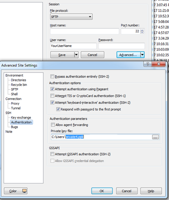
Connecting SFTP Public Keys for Authentication
https://winscp.net/eng/docs/public_key#private
Run SFTP Client on your computer as normal. Using Public Keys for Authentication, you don’t need to use password any more. Enter server Hostname, username, then click on “Advanced” button. Then add the PrivateKey file using SSH=>Authentication. Please Save and login to SFTP.
Once you’re on GC, please look for /var/www/html/. By default, it’ll redirect you to /home/YourUserName/ directory.
Adding and Removing SSH Keys on GoogleCloud
Follow this instruction to add and remove SSH keys on Compute Engine Instances.
https://cloud.google.com/compute/docs/instances/adding-removing-ssh-keys
For Mac, please follow this instruction to generate Public and Private Keys for Google Cloud
https://docs.joyent.com/public-cloud/getting-started/ssh-keys/generating-an-ssh-key-manually/manually-generating-your-ssh-key-in-mac-os-x
CentOS folder permission ftp user and apache on GoogleCloud
You can use access control lists commands.
First set owner apache to the directory
sudo chown -R apache:apache /var/www/public_html/test
Now set acl so that ftp user can upload folders.
FOR USER
sudo setfacl -R -m u:YourUserNameHere:rwx /var/www/public_html/test
FOR GROUP
sudo setfacl -R -m g:UsersGroupNameHere:rwx /var/www/public_html/test
Most Popular Screen Resolutions: Designing for Desktop and all mobile devices
/*mobile - landscape*/
@media only screen and (min-width: 568px) and (max-width: 736px) {}

/*mobile - portrait*/
@media screen and (min-width: 320px) and (max-width: 414px) {}


    @media screen and (max-width: 991px) {
    /* start of large tablet styles */
    }
    @media screen and (max-width: 767px) {
    /* start of medium tablet styles */
    }
    @media screen and (max-width: 479px) {
    /* start of phone styles */
}
Most Popular Screen Resolutions
Knowing that it is key to accommodate for the many different devices when designing websites, we have compiled a list of the most up-to-date devices with their respective pixel sizes and viewports below. We have also put this information into a handy downloadable PDF.
Desktops & Laptops
1024×768 pixels or higher
| Pixel Size | Viewport | |
| iPhone | ||
| 7 Plus | 1080 x 1920 | 414 x 736 |
| 7 | 750 x 1334 | 375 x 667 |
| 6 Plus/6S Plus | 1080 x 1920 | 414 x 736 |
| 6/6S | 750 x 1334 | 375 x 667 |
| 5 | 640 x 1136 | 320 x 568 |
| iPod | ||
| Touch | 640 x 1136 | 320 x 568 |
| iPad | ||
| Pro | 2048 x 2732 | 1024 x 1366 |
| Third & Fourth Generation | 1536 x 2048 | 768 x 1024 |
| Air 1 & 2 | 1536 x 2048 | 768 x 1024 |
| Mini | 768 x 1024 | 768 x 1024 |
| Mini 2 & 3 | 1536 x 2048 | 768 x 1024 |
| Pixel Size | Viewport | |
| Phones | ||
| Nexus 6P | 1440 x 2560 | 411 x 731 |
| Nexus 5X | 1080 x 1920 | 411 x 731 |
| Google Pixel | 1080 x 1920 | 411 x 731 |
| Google Pixel XL | 1440 x 2560 | 411 x 731 |
| Samsung Galaxy Note 5 | 1440 x 2560 | 480 x 853 |
| LG G5 | 1440 x 2560 | 480 x 853 |
| One Plus 3 | 1080 x 1920 | 480 x 853 |
| Samsung Galaxy S7 | 1440 x 2560 | 340 x 640 |
| Samsung Galaxy S7 Edge | 1440 x 2560 | 411 x 731 |
| Tablets | ||
| Nexus 7 (2013) | 1200 x 1920 | 600 x 960 |
| Nexus 9 | 1536 x 2048 | 768 x 1024 |
| Samsung Galaxy Tab 10 | 800 x 1280 | 800 x 1280 |
| Chromebook Pixel | 2560 x 1700 | 1280 x 850 |